M

Mochi UI

Claymorphism Design System

v2.0 — Open Source

Mochi UI is a modern React component library built around claymorphism — soft, tactile interfaces with spring physics, haptic feedback, and accessible design tokens.

Built for modern product teams with

AstroReact 19MotionTypeScriptThree.jsWeb Audio API
What is Claymorphism?

Soft UI that responds to touch

Claymorphism is the evolution of neumorphism — it replaces harsh shadows with soft, organic depth that mimics real clay. Every element in Mochi UI has physical presence: buttons compress when pressed, cards lift on hover, and inputs recess into the surface.

Unlike flat design or glassmorphism, claymorphism creates interfaces that feel tactile and responsive. It is the perfect middle ground for product teams who want personality without sacrificing usability.

Spring Physics
Every interaction uses real mass and damping
Accessibility First
WCAG 2.1 AA compliant with reduced motion support
Design Tokens
Figma-ready variables with automatic dark mode

Everything you need to ship faster

Mochi UI combines a comprehensive component library with production-ready tooling for design systems, product teams, and indie developers.

Spring Physics

Mass-spring-damper physics power every animation. No cubic-bezier guessing.

30+ Components

Buttons, cards, inputs, toggles, sliders, charts, modals, tooltips, and more.

Figma Compatible

Design tokens map 1:1 between Figma variables and CSS custom properties.

A11y Built-In

ARIA labels, keyboard navigation, focus rings, and reduced-motion support.

TypeScript Native

Fully typed props, strict inference, and IntelliSense-friendly APIs.

Dark Mode

Automatic theme switching with CSS custom properties and localStorage persistence.

Live component playground

Tune shape, surface, and spring response in real time. Press the preview button to feel each physics preset before you ship it.

Visual

Border radius20
42240
Shadow depth60
1055100

Colorway

Physics preset

Preview

Code

Copy
<ClayButton
  colorway="mint"
  style={{ borderRadius: 20 }}
  transition={{ type: 'spring',
    mass: 1,
    stiffness: 180,
    damping: 20 }}
/>

Production-ready components

Not just demos — real components you can drop into your next project. Every element is optimized for performance, accessibility, and delightful interaction.

Dashboard Widget

Revenue
J
$48.2K

Monthly recurring revenue

Goal progress72
050100
Users
👥
2,847

Active subscribers this month

+12.5% from last month

System Health

API99.9%
Database98.2%
CDN99.5%

Settings Form

Enable notifications
Dark mode

Buttons & Controls

Data Visualization

Q1
Q2
Q3
Q4
Adjust projection65
050100

Tooltips

Segmented Control

Selected: design

Skeleton Loading

Visual asset pack

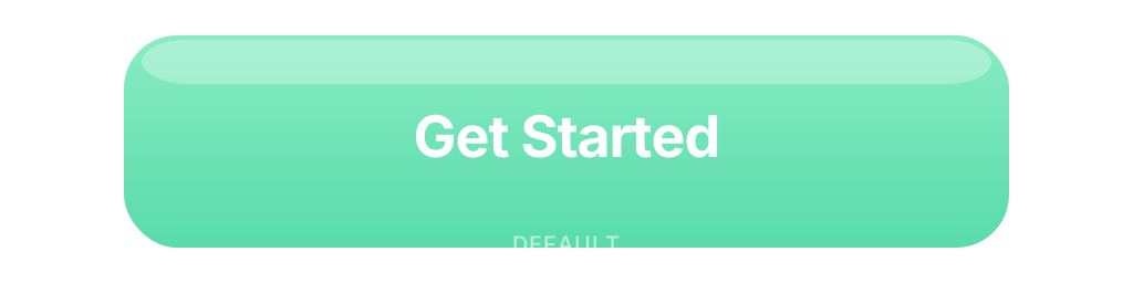
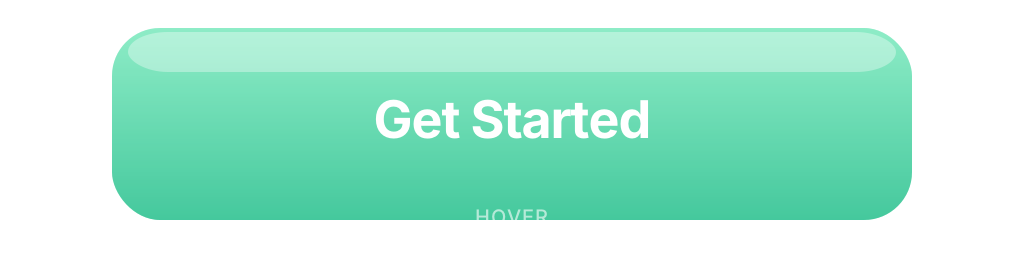
21 production-ready SVGs — clay icon pills, component thumbnails, hero backgrounds, and CTA button states. All MIT licensed and tree-shakeable.

Clay Icon Pills

Component Thumbnails
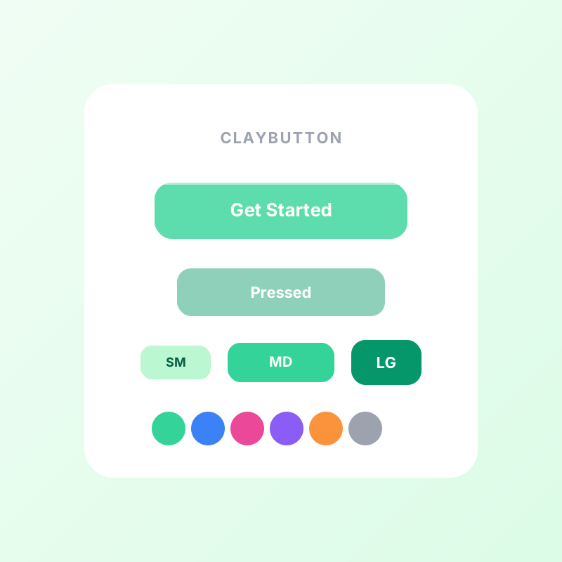
ClayButton component preview
ClayButtonmint
ClayCard component preview
ClayCardblue
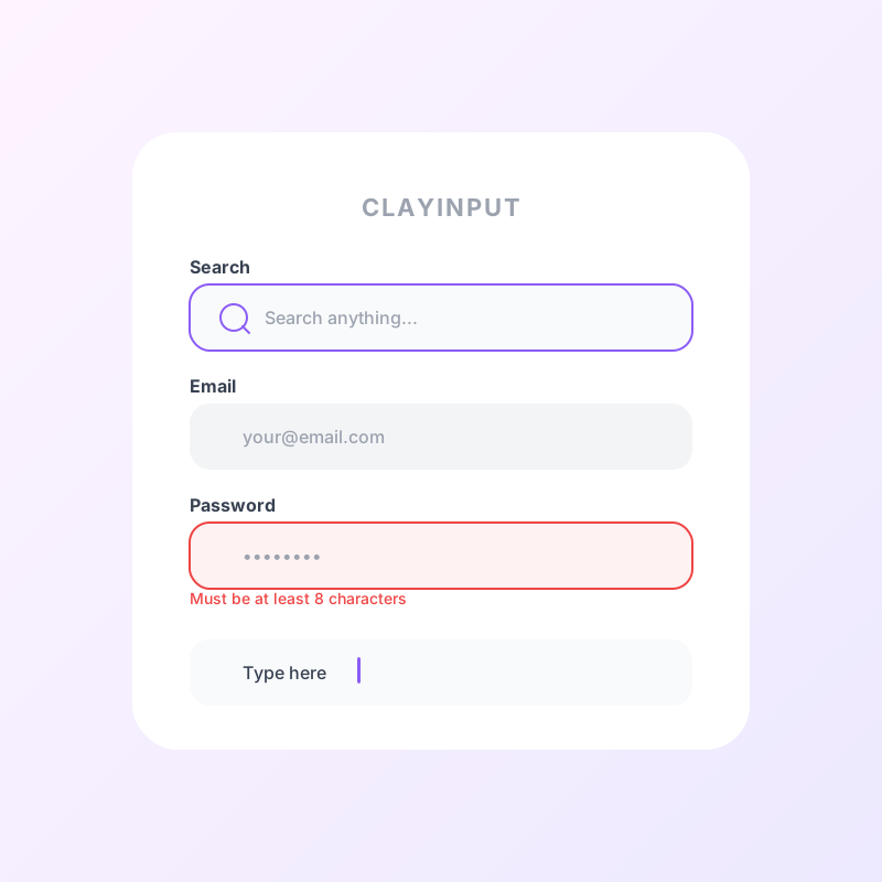
ClayInput component preview
ClayInputlavender
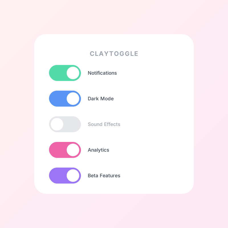
ClayToggle component preview
ClayTogglepink
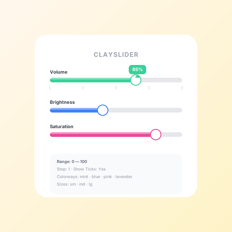
ClaySlider component preview
ClaySlideramber
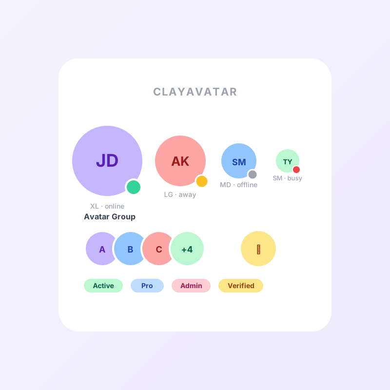
ClayAvatar component preview
ClayAvatarlavender

CTA Button States

CTA button default state
CTA button hover state
CTA button pressed state
CTA button disabled state

Built for every team

Whether you are a designer sketching in Figma or a developer shipping to production, Mochi UI fits your workflow.

For Designers

  • ✓Figma variable library with 1:1 token mapping
  • ✓Auto-layout components that mirror React props
  • ✓Dark mode preview baked into every frame
  • ✓Accessibility annotations for WCAG compliance

For Developers

  • ✓Tree-shakeable ESM exports with zero runtime overhead
  • ✓TypeScript-native with strict prop inference
  • ✓CSS custom properties for instant theming
  • ✓SSR-friendly with Astro, Next.js, and Remix

Ready to build something soft?

Install Mochi UI in seconds and start building claymorphic interfaces with spring physics, haptic feedback, and accessible components.

npm install @mochi-ui/react